
Industry Insights—RGD Designers on Graphic Design
Top 5 in graphic design—cameos in film
Work on the periphery of the graphic design world is my comfort zone—I develop content/information delivery systems. I am interested in those areas of design where designers are anonymous; where their products seemingly “happen” and very few people ever consider that someone toiled for weeks/months/years making something for perfection.
In the 1990’s, I worked with David Peters to publish a top 100 list of film title sequences for the AIGA. That work was the inspiration for this article. I choose, however, to veer aware from title sequences and avoid graphic design products in film that are “characters” in and of themselves (hero props)—I am referring to the absolutely astounding Annie Atkins and her work for Wes Anderson’s The Grand Budapest Hotel, among many other films. Instead, I chose look at graphic design cameos in film: sometimes props, sometimes a role, at other times a dialogue. This list is dedicated to designers, art directors and writers. I also dedicate this to the late Alan Rickman (graphic designer, Chelsea College of Art and Design, and Royal College of Art).

1. Our Industry
Television shows, like Felicty and the L Word mention graphic designers. Even the highly viewed American version of The Office storylines Pam Beasley Halpert leaving the Pratt Institute’s graphic design program to return to Scranton, PA. In Prelude to a Kiss (1992), Meg Ryan identifies herself as an aspiring graphic designer. While some film and television make reference to our industry, few have provided major roles for graphic designers. In response to a class assignment, Central Saint Martins graphic design alumnus Ellen Mercer and Lucy Streule compiled the supercut FYI, I'm a graphic designer, a collection of eighteen references to our industry as portrayed in film and television. “Sounds like a cool, rewarding job!” I will let you be the judge.

2. What we do
While attending design school from 1988–1992, I recall the anticipation of viewing Scorsese’s remake of the 1962 Cape Fear. Incredible title sequence aside (Elaine and Saul Bass), this was the first time I watched an actor in a role describing what we do as designers. In an early scene, Jessica Lange portrays graphic designer Leigh Bowden describing the craft of design to daughter Danielle (Juliette Lewis):
“The idea is to resolve the tension. I need to find a motif that’s about movement. Not the most mind-blowing concept for a travel agency, but what the hey?” describes Leigh (Lange). “Like an arrow, maybe?” suggests her daughter. “Yeah, like an arrow.” Leigh continues “But then the other aspect is stability, a company that you can trust. If you can balance those ideas in a way that’s pleasing to the eye, then you got a logo.”
Whether or not we agree with this synopsis, at least it’s better than being depicted as aficionados in photoshop or “…anyone with a laptop.”
3. The work of practicing designers
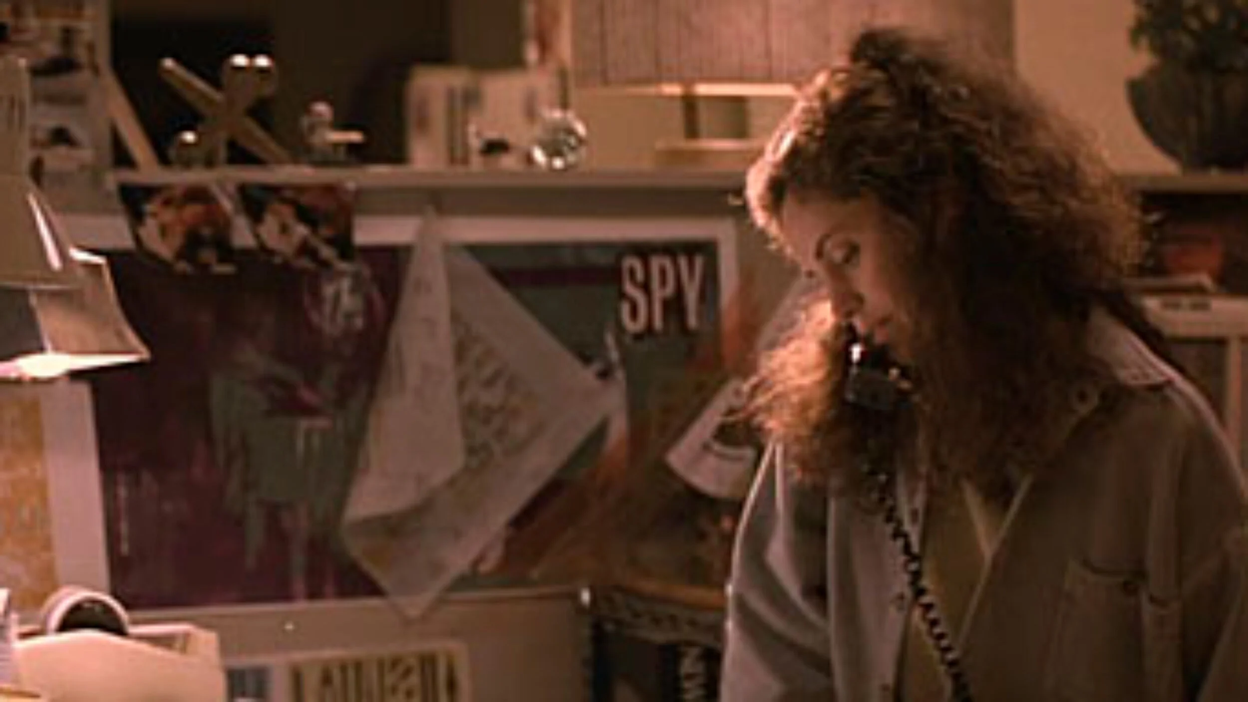
Continuing with De Niro as part of my storyline, I shall to jump to Michael Mann’s crime thriller Heat. There are numerous reasons why Heat left an indelible impression on me, not the least of which was Mann’s use of props for a scene (Margie Stone McShirley, art director). When I first saw Heat in 1995, I immediately recognized the graphic design of my youth: at the time, the props seemed authentic. In particular, it was the work of British designer Neville Brody in the film that piqued my attention. For a more in depth analysis of the Brody references in this film, read John Coulthart’s blog.

4. What we create
Any snickers in the audience for this next film reference were definitely from graphic designers. I am referring to Mary Harron’s adoption of Bret Easton Ellis’s novel American Physcho which was striking on many levels, not all of which were pleasant. One of many scenes I will never forget was a dialogue between Patrick Bateman (Christian Bale) and his co-workers on business cards. After a bout of one-upmanship on paper stock, type choice, ink, and print technique, choking with anxiety, Bateman suggests “Impressive. Very nice. Let’s see Paul Allen’s card.” From a silver case, a colleague proceeds to reveal a business card to be shared with Patrick. Bateman swallows, speechless, and all goes silent. In a voiceover by Bale: “Look at that subtle off-white colouring. The tasteful thickness of it. Oh my God, it even has a watermark…” While the humour of this scene for the untrained eye is the fact the cards are seemingly identical, for designers including myself, the scene broke continuity as I thought, “Is this what I do for a living?” Oh, and that space between the ampersand and Pierce, not to mention the misspelling of “aquisitions."
5. Homage and continuity
The art department for a film is responsible for curating and generating sets that look authentic. Prop continuity often refers to a scenario like where there might be a drink: it should only ever decrease in volume at a constant rate, in a scene where someone is sipping from it. Likewise, it is critical that the props themselves are place and period-appropriate. The props used in Heat seemed plausible - a graphic designer in 1995 would be influenced by late-eighties design. However, sometimes a prop is too clever and can be a cause for loss in continuity, particularly for subject matter experts like ourselves. I was reminded of this recently upon watching Greg Durrell’s Design Canada. In his documentary, Durrell showed a clip from Mad Men that used a CN Rail advert above the railcar backrest. I am certain most American audiences viewed the prop as appropriate. For me, however, the poster’s authenticity immediately removed me from the episode: proud on one hand, a loss in continuity on the other.
Other references
Interested in more? Check out Roman Mars’ interview with Annie Atkins on her work including The Tudors and The Grand Budapest Hotel. Or this piece about graphic designer Martin Charles and the role he plays in film.

RGD | Association of Registered Graphic Designers
The Association of Registered Graphic Designers is a non-profit, professional Association that represents over 3,800 design practitioners, including firm owners, freelancers, managers, educators and students. Their vision is for a graphic design profession that is broadly valued for its contribution to life, commerce and society.
