

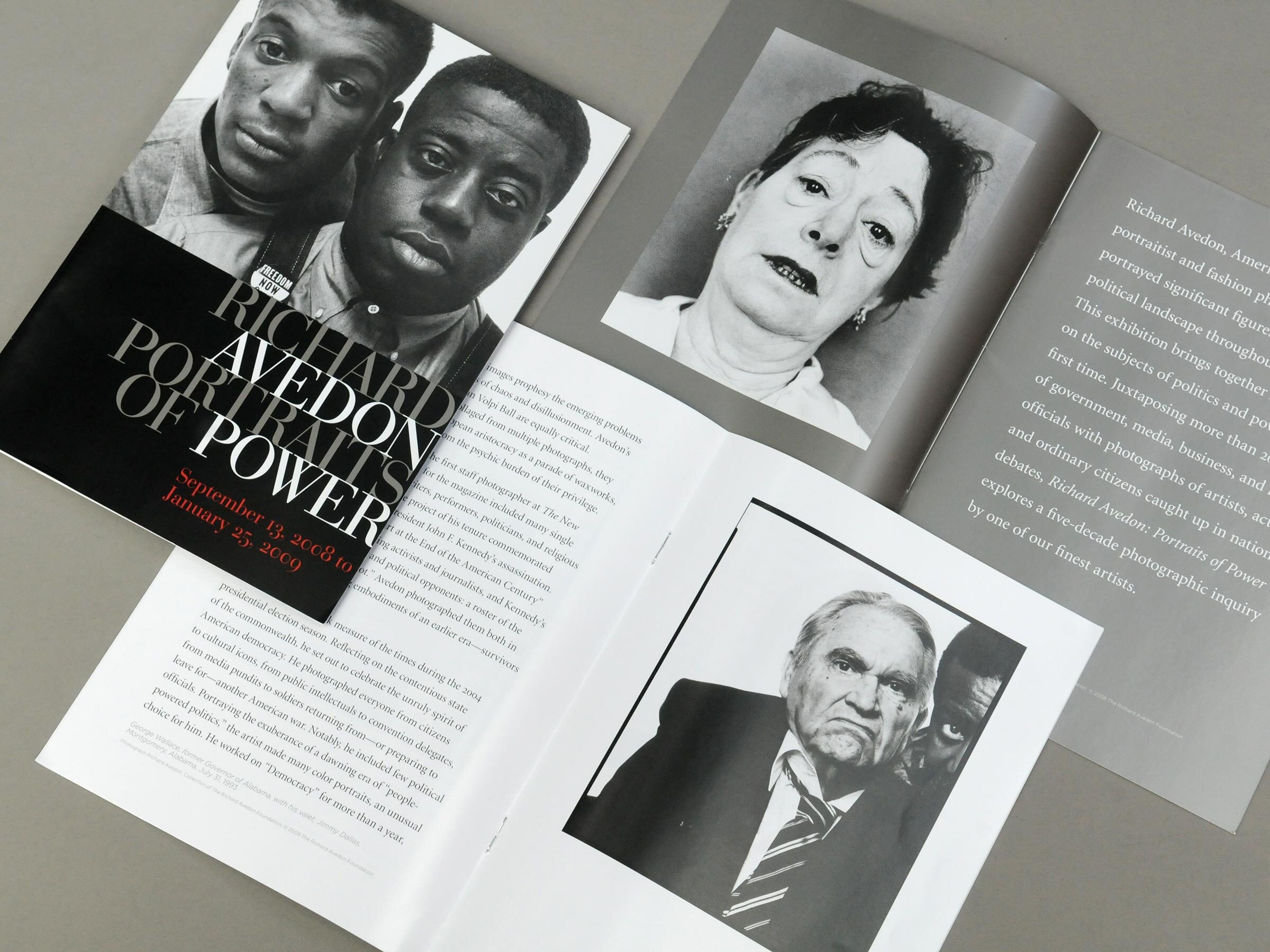
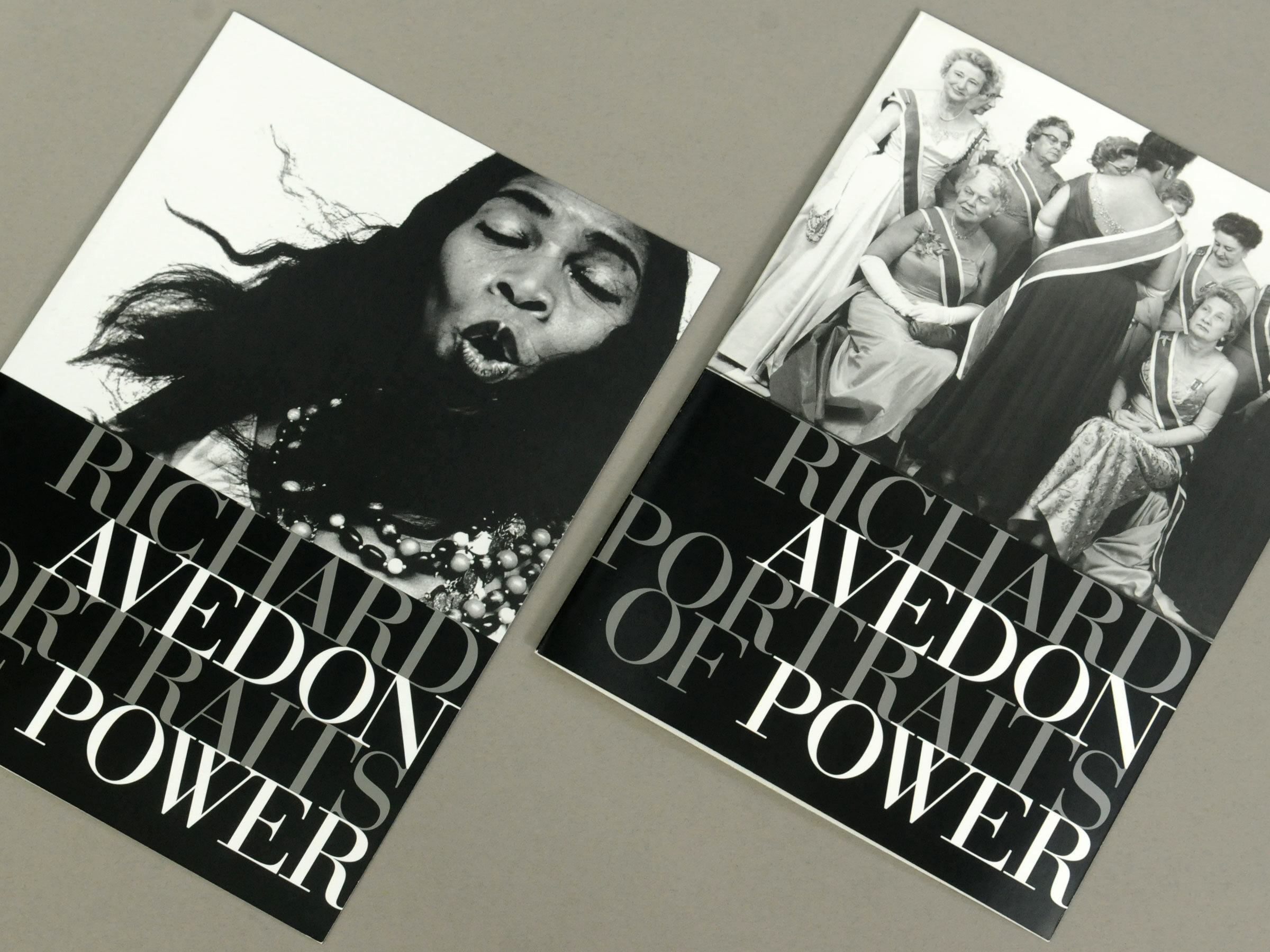
Richard Avedon: Portraits of Power
BRAND AND EXHIBITION DESIGN CASE STUDY
Richard Avedon—America’s pre-eminent portraitist and fashion photographer—portrayed significant figures of the American political landscape throughout his career. This Corcoran Gallery of Art’s 2008 exhibit brings together Avedon’s work on the subjects of politics and power, for the first time; timely aligned with the 2008 presidential election. Juxtaposing more than 200 images of government, media, business, and labour officials with photographs of artists, activists, and ordinary citizens caught up in national debates, Richard Avedon: Portraits of Power explores a five-decade photographic inquiry by one of our finest artists.
Outside the fashion world, however, Avedon is best known for his portraits. In the age of movements that challenged institutional authority, like those for civil rights and against the Vietnam War, Avedon’s portraits broke through the glossy artifice of celebrity and official power and seemed more authentic.
—Martha Schwendener, NY Times

Design firm Office of Design, Corcoran Gallery of Art, Washington, DC, USA. Design team John deWolf (creative director, graphic design, exhibition design), Maria Habib (graphic design, media coordination) Curatorial Paul Roth (curator), Amanda Maddox (assistant curator), Elizabeth Parr (exhibitions director), Dana Gildenhorn (exhibitions officer) Sub-consultants Alan Abrams (print coordination), Rod McDonald (typographic design, wordmark refinement), Dodge Color (signage), Blueline Design (screen printers), Westland Enterprises (print collateral)
Award Art Directors Club—Metro Washington ◆ Award of Merit • exhibition collateral • 2009

Context
Presidential election
To start, recognizing the exhibit’s timing—early-September 2008 to late-January 2009—is necessary as is understanding the photographer's relative renown. Unpredictably, 2008 turned out to be a historic presidential election season.
US elections take place on November 4, 2008, and Inauguration Day is January 20, 2009
The Corcoran Gallery of Art is located next door to the White House, mere yards away.
Destination D.C, coincidently, brands the 2008 election season using such phrases as Power Center, Power Trip, Staying Power, among others.
The name Avedon is known—almost a household name—yet many recognize Avedon as a fashion photographer.

Avedon’s final project took measure of the times during the 2004 presidential election season: notably, he included few political officials. He did however recognize the import of Barrack Obama.
The 2008 presidential Democratic campaign, with vice-presidential nominee Senator Joe Biden, defeated the Republican nominee, Senator John McCain of Arizona, making Obama the first African American elected President.
To create the last element of surprise in the exhibit, we mounted a print of Obama behind a standalone wall across from an image of Karl Rove.

There are 239 photos in the exhibition, 234 of which are in black and white, and only five are in coluor. Consequently, the exhibition and collateral primarily use black and white colours.

In 1969, Avedon developed a new and distinct style. Adopting an 8×10-inch view camera, he photographed figures in a starkly minimal style, with even light against white or grey studio backgrounds. Furthermore, the preservation of the negatives’ black border (rebate) is a signature Avedon trademark—achieved by filing darkroom enlarger’s film holder.


Precedent
The Family: The Rolling Stone Portfolio
In 1976, commissioned by Rolling Stone, Avedon made a portrait series depicting America’s leadership at the time of the country’s bicentennial. “The Family” includes 69 portraits of select members of the political, legal, media, military, and corporate elite. Published on the eve of that year’s presidential election, the portfolio was immensely controversial. It is now regarded as a signal achievement in the history of photographic portraiture—an uncompromising visual survey of institutional authority.


Process
An homage?
Various institutions' departments began looking at finalizing artwork loans, sponsorship opportunities, alerting the press, writing educational materials for schools, developing continuing education curricula, and setting up public programs such as lectures. Concurrent with a proper development process, Corcoran required a branded packet that could be released to the public while at the same time not unveiling the exhibition brand too early: a brand-lite approach.
Knowing “The Family” was a cornerstone of the exhibition, an obvious approach was an homage: to play off the familiar, using it for a few select documents.

Multiple options
Curator Paul Roth began working with all departments in the institution to ensure we knew of Avedon, the importance of this body of work, and the character of Roth’s exhibition. His vision formed the basis for our design brief. From here, the in-house design department for the Corcoran Gallery of Art began developing multiple concepts.
We presented three options: A & B as shown below; and a third and chosen option, explained in more detail later.
As graphic designers, we explore numerous logo possibilities—sometimes hundreds—typically in a sketch with notes. Reviewing each against the design brief, we choose a handful to refine in preparation for sharing. When we present, we typically show two, or even three options. For each, we present a rationale tying each to the design brief: we listen to feedback, and discuss the next steps. At times, it is as simple as selecting an approach and moving into the development phase.


OPTION A—THE FAMILY
Avedon and assistant Elizabeth Paul crafted the distinctive wordmark used on the cover of the special issue of Rolling Stone. They chose the font Alternate Gothic No. 1 and “stacked” the portfolio title and date with the photographer’s name inside the frame lines of the 8 x 10-inch format, in a clever homage to Avedon’s signature style. It felt obvious not to flesh out the concept as an option.
It was a decent option and paid an appropriate amount of respect to the artist. On the one hand, the option forced us into using a strict grid, which was appropriate given “The Family” displayed images either one- or four-per page. On the one hand, the grid could prove limited when working with variable ad sizes. Much internal debate ensued: where did it fit on the spectrum of appropriation, homage, and pastiche?


OPTION B—POWER
This option plays heavily on the sobriquet Avedon and the word ‘Power.’ If this concept had moved forward, we would develop a custom wordmark. The wordmark would place emphasis on the counter-spaces of the letters “D/O” and “P/R”, reworking them to be close to medium- and large-format film proportions (square and 4:5). The “AV” ligature, as well as the “W” would need much work. The concept also suggests using only two images throughout the exhibition’s run—it is a common practice among museums to use one and sometimes a couple of signature images.
The asymmetrical lock-up produced predictable layouts—unforgiving vertical orientations—requiring bespoke layouts every time accounting for logo and sponsor information placement. The merits of using non-stereotypical photos to represent Avedon made for a positive debate. The bold mark, however, overshadowed the art.

Pre-eminent fashion photographer
A household name
Many are familiar with the name and work of fashion photographer Richard Avedon. However, his surname likely resonates more than his full name (hence the “Avedon” sobriquet). Wanting to capitalize on his association with fashion, we chose a Didot typeface as a reference to magazine mastheads of the fashion industry. With its contrasting thick and thin strokes, Bodoni's overall geometric construction has similarities to Avedon’s preservation of the 8×10 black border, a signature trademark. What struck us most about earlier explorations was highlighting the word ‘Power' and the word’s potential for campaigns and public programs—also adopted by Destination DC.
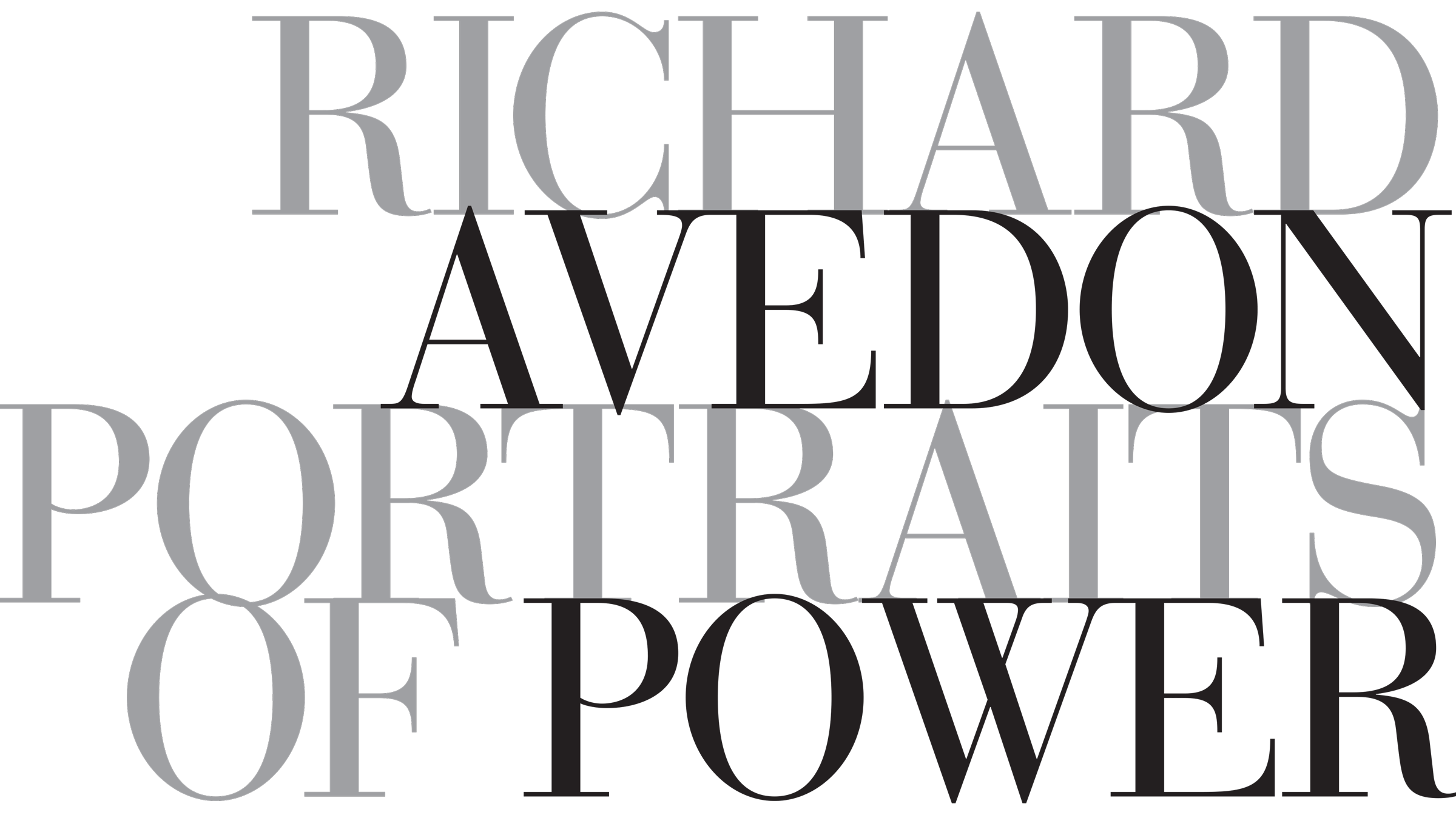
Option C—an early draft of the wordmark


Around 1784, Firmin Didot cut the first modern face in Paris, followed by the prolific Giambattista Bodoni. This revival of Bodoni’s types—Bauer Bodoni by Bitstream—was made under the direction of Heinrich Jost. Punches were cut by Louis Hoell.

power (noun) | 1: ability to act or produce an effect; 2: possession of control, authority, or influence over others; 3: physical might; 4: political control or influence ¶ power (adjective) | 1: of, relating to, or utilizing strength (plays a power game), also powerful (a power critic) 2: of, relating to, or being a meal at which influential people discuss business or politics (a power lunch)
Ideation
I owe a design instructor a debt of gratitude. To this day, I refer to the Rhetorical Handbook when starting a project. This guide to rhetoric for graphic designers was created by Hanno Ehses, faculty at Nova Scotia College of Art and Design, in 1987, with assistance and contributions from Ellen Lupton, curator of the Herb Lubalin Study Center at The Cooper Union. The rhetorical figures—tropes and schemes—helped this project, particularly the concepts of irony and antithesis, which provided the framework—from a design perspective—to examine political portraits by a photographer best known for his fashion industry work.
irony (noun) | 1: an expression that conveys a meaning opposite to its literal meaning ¶ antithesis (noun) | 1: the antithesis of prose and verse

This publication evolved out of the catalogue for the exhibition Hanno Ehses: innovative teaching/experimental typography held by the Herb Lubalin Study Center at The Cooper Union, April 1987. Edited and designed by Ellen Lupton, it includes essays by Ehses and Lupton, illustrated with student work compiled by Hanno Ehses, published by the Design Division, Nova Scotia College of Art and Design, 1988.
REFINEMENT
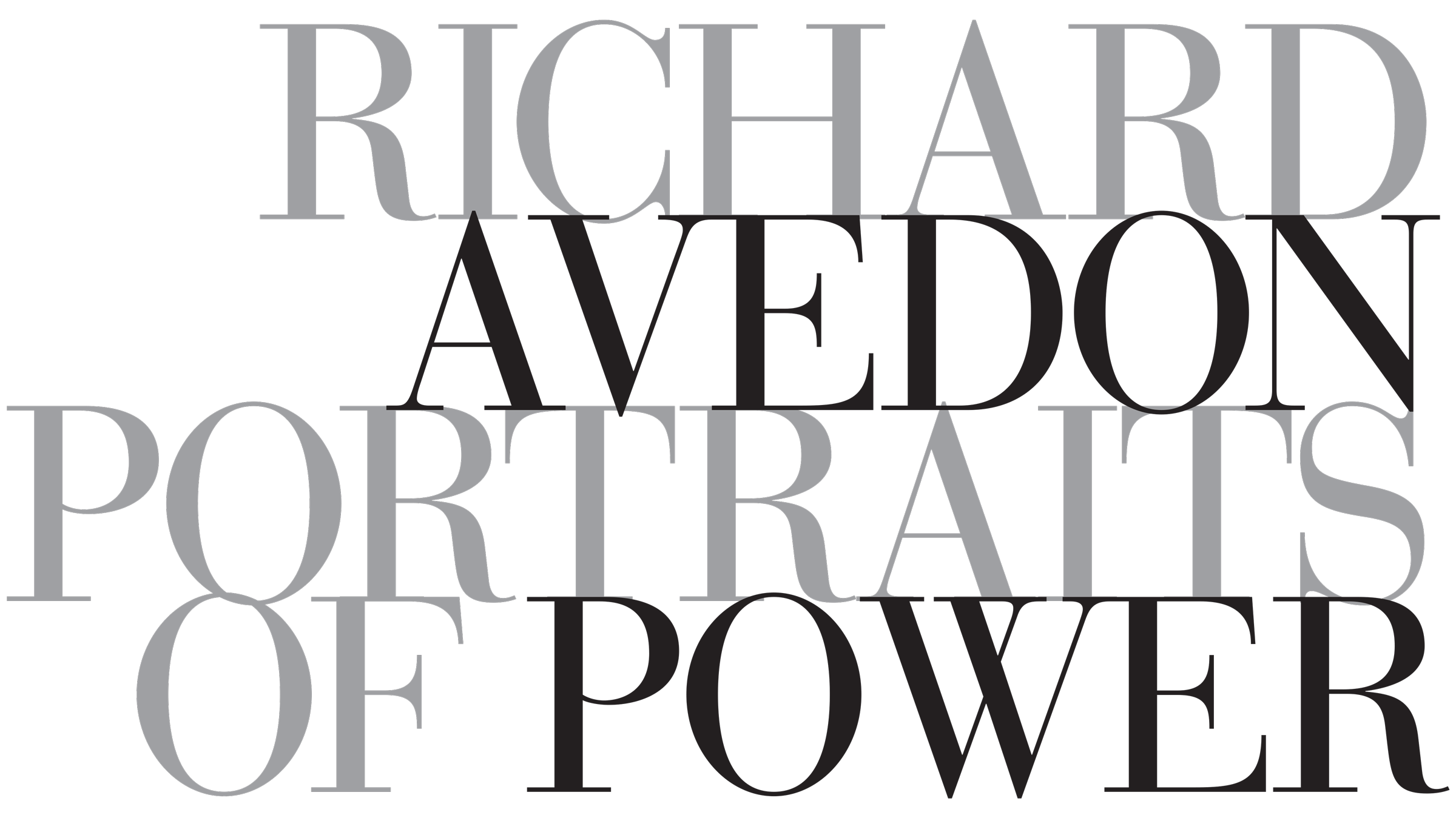
Upon approval of the approach, we refined the typographic details, paying particular attention to serif details and further refinement of letter spacing. Most of the letterforms were redrawn and tweaked.
To stack or overlap Before refining the wordmark, much debate arose over a detail: our treatment of the serifs. Should the serifs stack or overlap? In our opinion, the slight 'up/down' of the ‘stacked’ serif added an undesirable level of visual noise. We argued, a cleaner approach involved overlapping the serifs—given they were so fine—which is less conventional in typographic circles.

To stack or overlap? Normally, type can ‘kiss’ but “never touch.’
Merely a starting point
When developing a logotype, a font is only the starting point. Unlike text, where letters appear in random combinations, a logo is a specific set of letters married for all time. Striking a delicate balance of letter pairs and the word as a whole is our goal. Richard Avedon: Portraits of Power, has numerous letter-pairings to contend with, and stacking the words meant even more complex combinations, horizontal and vertical. For this project, we used the Bauer cut of Bodoni merely as a starting point. Rod McDonald expertly redrew the wordmark: very few letterforms remain identical.


For close to half a century, Rod McDonald provided hand lettering and typographic styling to the Toronto advertising and design community, designing for many leading Canadian magazines, including Applied Arts, Maclean’s and Toronto Life. Rod’s typefaces include Cartier™ Book, Smart Sans™, Slate™, and Gibson.
Respect
Reproduction quality
Out of respect for the quality of Avedon’s gelatin silver prints, we were concerned about the quality of reproduction. A visitor carrying a gallery guide could compare their brochure to the real thing. Thus early on, we ran on-press test samples. We tested paper, and ink to assess the quality of a final product. It also allowed us to finesse other elements.
We tested the following:
for imagery and the solid background: one colour (black) versus two colours (black and black 6)
rosetta versus stochastic screens
for the words ‘Richard’ and ‘Portraits of’, tested in various tones (ranging from 60–75% black) versus a metallic spot colour

The results proved as suspected: offset printing using a standard rosetta screen—even a duotone—would not produce a comparable reproduction.

Press-proof: two-colour (black and black 6) solid background, 10-micron stochastic duotone.
Conventional printing (upper square) uses evenly spaced dots—larger in size in the darker areas and smaller in size in the light areas—to depict an image. Stochastic screens (lower square) )use tiny randomly distributed dots to create the desired ink density, yielding better detail in light and dark areas, and are evocative of film grain. NOTE: select the image to see more detail.
Colour
For exhibition support collateral, faithful reproductions of Avedon’s work was critical. We reproduced all photographs using stochastic duotones comprised of two shades of black ink, in addition to a dull metallic silver and solid red. Overprinting the two black inks created a dense background for amplified contrast when using the wordmark. The ‘pewter’ coloured metallic ink had a similar reflectivity to that of a silver gelatin print.
A 12 page exhibition program of Avedon’s work. printed in 4 spot colours.
PAPER AND FINISH
Promotional material was printed on a six-colour press, using black, Black 6, metallic, and red ink. The metallic—PM 8402—was not a traditional colour, and appeared more like pewter; evocative of the silver in gelatin silver prints. The work was finished with an inline aqueous coating, and a satin varnish for the words ‘Richard’ and ‘of Power’ (PMS 8402). For paper, we used Kromkote, an unparalleled cast-coated paper—renowned for its brilliant, mirror-like gloss surface and smoothness; again suggestive of GSP prints when held in-hand.
Different from flat black, Black 6 is a very dark shade of cyan-blue. Instead of a single hit of black (right half)—or even a double hit—to achieve a dense black background, we used two plates: flat black and Black 6 (left half). The two blacks were purposeful for other reasons: the blacks in combination helped maintain faithfulness to the gelatin prints when reproduced as duotones using a stochastic screen.
Respect
Richard Avedon printed his images exposing the rebate (Henry Kissinger, at right), reinforcing the notion that the viewer is seeing the subject directly as Avedon saw them, and not cropped later in the darkroom. There is a sense of authority and sincerity both at the same time. The wordmark, presented edge-to-edge when possible, alludes to a sense of Avedon’s photographic style and authority. Furthermore, the antithesis between the emblematic Didot typeface and the wordmark’s edge-to-edge placement achieved the desired level of authority or influence implied by the word Power. We wanted a ‘mighty’ wordmark that did not overpower the photography.


TONGUE-IN-CHEEK?
The Corcoran’s direct neighbours were the White House (to the East) and The Daughters of the American Revolution’s Constitution Hall (to the South). Our members and the DC-elite are aware of this.
For opening events, different groups receive invitations for separate events. Neither VIP would see a member’s invitation, nor vice-versa. Avedon depicted subjects in crisis, embattled by their engagement with the world. For this provocative—perhaps cheeky—group of invitations, we use Marian Anderson's image for the member’s opening event and the Daughters of the American Revolution for the VIP gala.
Regrets? For the image pairing: a firm no. From a design perspective—yes—I cannot fathom why I did not trim the invites so that the logo bled on four sides.
Today, the DAR encourages and celebrates diversity in their organization, it was not always the case, however. In 1939, opera singer Marian Anderson was denied the opportunity to perform in DAR Constitution Hall because of her race. She subsequently performed a historic concert on the Lincoln Memorial's steps to a crowd of 75,000 people.

Exhibit design
Leaving the world of colour
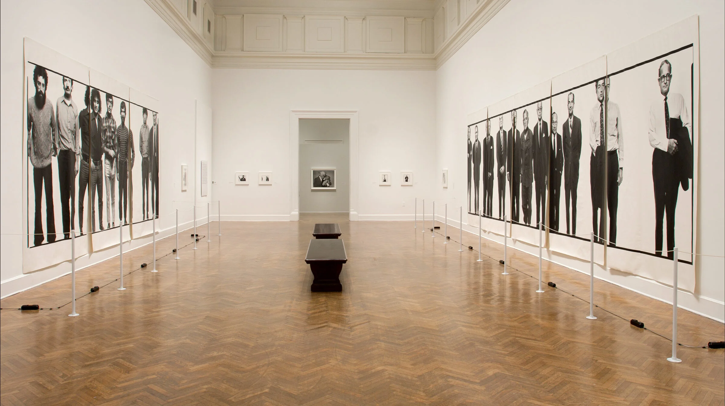
Upon entering the museum at the lower level, the visitor is confronted with brilliant red walls; the ‘chilli pepper’ colour—painted for the exhibition’s duration—continues upward to most of the gallery’s upper-level walls. As the visitor ascends the grand staircase en route to the exhibition, a grey wall reveals itself. Approaching the exhibition title graphic and symbolic images on a single grey wall, the visitor experiences the effect of colour stripped from the space. Eight large-scale black and white portraits are displayed in the “grey-scale” environment, book-ending the exhibition entrance.

From the lower atrium, the visitor views five banners against a red wall backdrop. The red strengthens with accent colour in promotional material; even the café menus and table settings adopted the red.
In the first few galleries—the 1950s—wall colours are a few grey tones, evocative of the backdrops used in Avedon’s early-career. However, in 1969, Avedon developed a new photographic style for Hard Times. Replacing his earlier portraits’ overt expressionism with stark minimalism, he used even lighting against plain white backgrounds. The shift was dramatic. In the exhibition, gallery wall colours shift to a stark white—Benjamin Moore’s Chantilly Lace—with a less dramatic and more even lighting scheme.


Mid-exhibition and mid-career, there is a recognizable shift. Avedon departs from the precision of his typical, large-format work to shoot on 35 mm. Camera and assignment in hand, Avedon travels to Germany for Berlin’s first New Year’s Eve since the fall of the Wall. Initially conceived for the French literary magazine Egoiste, the Brandenburg Gate series remains a study in portraiture, however poorly received. Our gallery walls employ dark paint (Benjamin Moore’s Grey) signifying the shift, and we employ nominal gallery lighting contrasted with spotlights on the photography.

Narrative environments
Can photographs speak?
Certainly. In the Atrium photo previously shown, the visitor surely reads meaning into director John Ford looking over his shoulder at actors turned politicians, Arnold Schwarzenegger and Ronald Reagan—a ploy we use elsewhere with Ford.
As a retrospective of a career, by design, the collection of Avedon photos is loosely organized by time, pending physical constraints: scale of art on loan and size and orientation of the gallery’s walls. At a high level, the organization of portraits provides context to the works of art—the American political landscape. The exact placement of art within the room favours creating connections and prompting dialogue between works of art—a narrative.
Image pairings—two images placed aside from each other—are linked through proximity, gaze, history, gender, class, race, and many other attributes. There are other ways images tell stories: portraits on one wall facing another, two images in a corner, and the gaze they may or may not share with each other. Working with the curator, the exhibition designer must consider all these.
Upon entering the exhibit’s second gallery, hung on a standalone wall at the end of the space, we confront the viewer with an oversized image of William Casby—the last living American slave. The visitor must then consider questions of power, identity, and race.

Employed in a few instances in this exhibition, we place a wall just beyond a doorway, typically to shield the view to the next space; all vantage points, however, must be considered. From one gallery to another (above), John Ford hawkishly gazes into a gallery dedicated to Avedon’s six-week 1971 trip to Vietnam. The exhibition panels do not interpret Ford, though some visitors would know his documentary Vietnam! Vietnam!, shot in 1968 but not released for years. Made for the United States Information Agency (USIA), the film managed to offend almost everyone when finally released in 1971.
Elsewhere, a Catholic Priest and Buddhist monk pairing in another standalone wall look on as Germany’s New Year Eve celebrations ensue.

Learning environments
Extending the experience
The museum gift shop plays another role in the visitor experience. There are few elements to this thought. First, more weighted on consumerism, a memorable sensory experience can prolong a visitor’s retention of the museum visit. A visitor can display a mug or t-shirt with a sense of pride while at the same time the object stimulates memories of the museum experience. Second, an exhibition run is often short, typically only a few months, so the object also enhances the museum’s brand, but not necessarily for the exhibition after the close date. The museum leisure and consumption activity also have other learning opportunities. Third, The gift shop is another opportunity to supplement the educational experience by providing curated collections of material associated with the exhibition. For example, publications by the artist or books by other artists on the same subject matter provide supplementary context for those visitors stirred by the work. Thus, the education can extend well beyond the museum visit if publications are taken home.


T-shirt (left) The exhibit catalogue designed and published by Steidl (right).


Options for the book jacket


Typical spreads (above and right) from the book designed and published by Steidl.